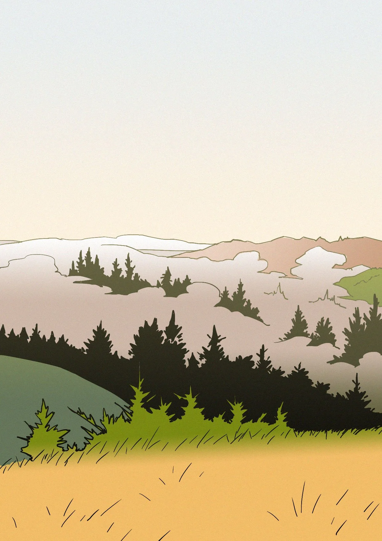
Here’s a collection of landscape studies from the past couple of years. There’s a couple of different style experiments going along with some extensive use of gaussian blur… I did about 30 of these studies over the past 3 years or so, keeping roughly the same style but experimenting in little ways on each one. My favourites are now on my homepage but out of the remaining ones I had a soft spot for these four.
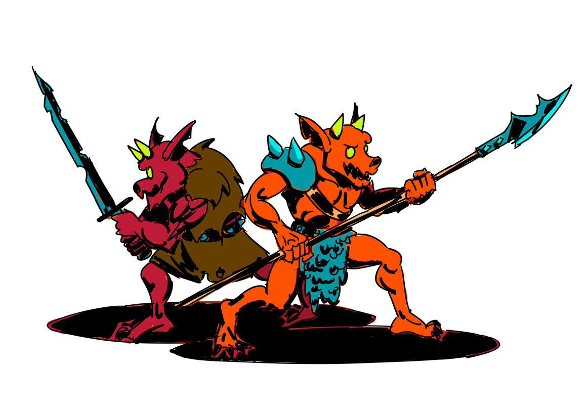
Kobolds!
Doing some D&D inspired sketches and drawings at the moment, part of a little project to try and push my drawing skills. Hopefully the start of some more frequent updates on this site.
Revisiting Work
Every time I update my portfolio I inevitably go back to these two pieces of Ikaruga fan art. There’s still various old versions of them floating around the internet on different sites. In general I don’t like revisiting old work, but I seem to have developed an ongoing relationship with these two portraits so here’s a quick post to document how they’ve changed over the years:
Starting in the top left, this is the original from 2008. It looks pretty goofy to my eyes now but I remember being proud of it at the time. I forget when the change to the top left version but the bottom left is from 2017 and the bottom right is from today. The outfit and a lot of the pixel clusters in the hair remained untouched, in the first update I was concerned with increasing the colour count and refining the shading, then the final two updates I focused on trying to fix that blank expression.
In 2020 I managed to reduce the colour count and add some more interesting colour ramps in to the palette.
Is it finished now? Who knows how I’ll feel 10 years down the line…
I must’ve been pretty happy with this one as after the 2008 original I only made one update until now. It was a much better piece from the off which had more of a sense of character from the off. The second update just adds more colours, contouring and lots of soft edges. I’ve fallen out of love with that style of very soft aliasing so for the final version I hardened up all the edges, cleared up some ambiguous volumes and pixel clusters on the neck and ears and reduced the colour count and reworked the palette. I also tweaked the expression, took out that slight smile, but stopped short of a full scowl.
More Clouds, pixel style
Still working on this clouds project. Pixel art cloudscape based on photo reference. The first image is overlaid with a rough CRT TV / Monitor effect I bodged together, the second is the clean pixels. I recent read the new Bitmap Brothers Universe book where the design team have gone to great ends to reproduce pixel artwork from classic games like Speedball 2 and The Chaos Engine as it would look with your old Atari / Amiga / Megadrive / etc. hooked up to a dodgy old 14" CRT TV.
My gut instinct has always been to display pixel art as cleanly as possible, something that is sometimes a headache (if you're viewing this page on a small tablet or phone, chances are these images won't reproduce cleanly...). Sometimes I'll even pass on re-releases of classic games if I can't display the art with clean pixels, completely unflitered. This book has got me thinking about other ways to present pixel art, and is a timely reminder that the technical aspects of the artwork in many old games and scene demos were optimised for displaying on CRT displays.
Starting 2017 with some more pictures of clouds
Following on from my last post, here's the last few studies I came up with over the Christmas period. Moving on from the digital paintings I tried my hand at some drawings and graphic art with the same subject matter of clouds and wide open spaces.
The above image is my first attempt at breaking down the silhouettes and volumes of clouds and the quality of light. For step 1 on the left I picked 4 tonal values and by eye attempted to reproduce a photo using these limitations, aiming for accuracy. The end result unfortunately looks like a photo put through a Photoshop filter, despite being drawn by hand. My solution was step 2 on the right where I simplified everything, concentrating on composition influenced by, but not reproducing, the original image. A big improvement to my eyes!
I followed this up with the following set of studies:
I was looking for a middle ground between the accurate reproduction of the outlines of the photo and a more stylised approach. I never got to a point with this image where I was satisfied but I did like the final steps use of line work against large blocks of colour.
So these two steps of studies led to the image at the op of this post and the one that ends it - playing line work and solid volumes off against each other with a bit of care and attention paid to atmospherics without distracting from the underlying drawings.


